My whole life, I have loved the American Girl doll brand. The combination of historical adventure, strong girlhood, and the universal experience of growing up ignited a passion in me that has never left me, even as I became an adult.
This love led me to become a fan of the podcast and subsequent book, Dolls of Our Lives. After devouring the episodes and the audiobook, I decided to redesign the cover of both as a personal project.
Typography
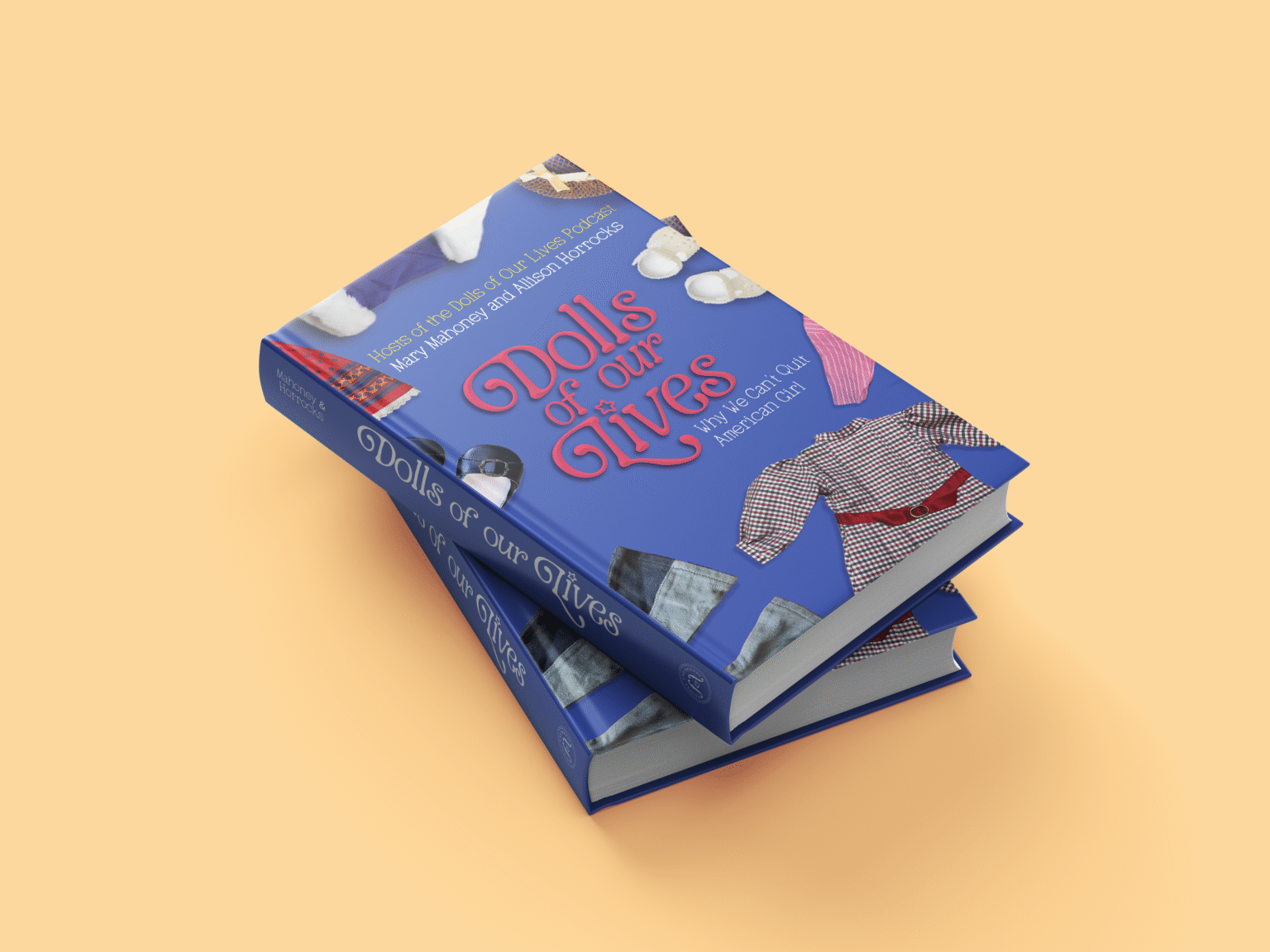
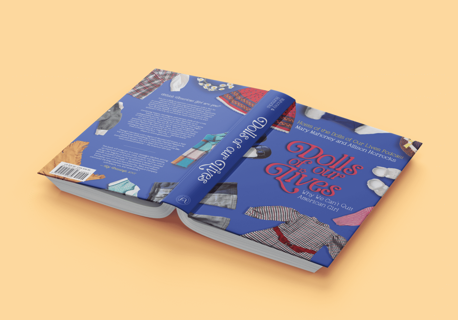
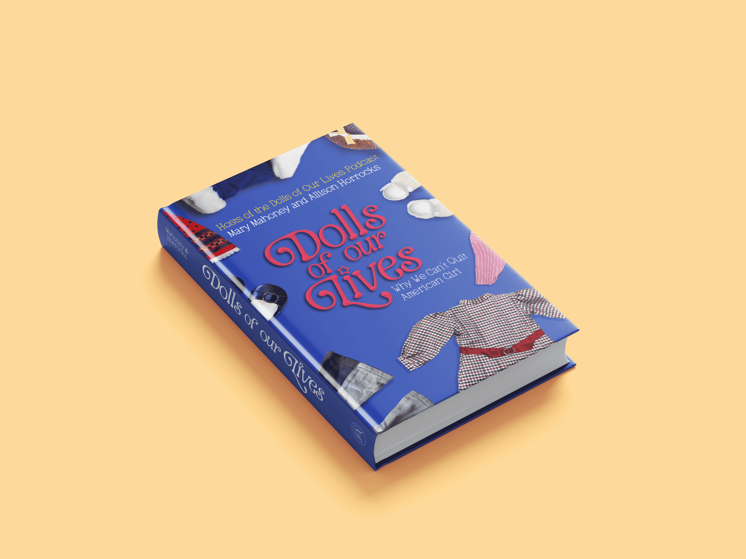
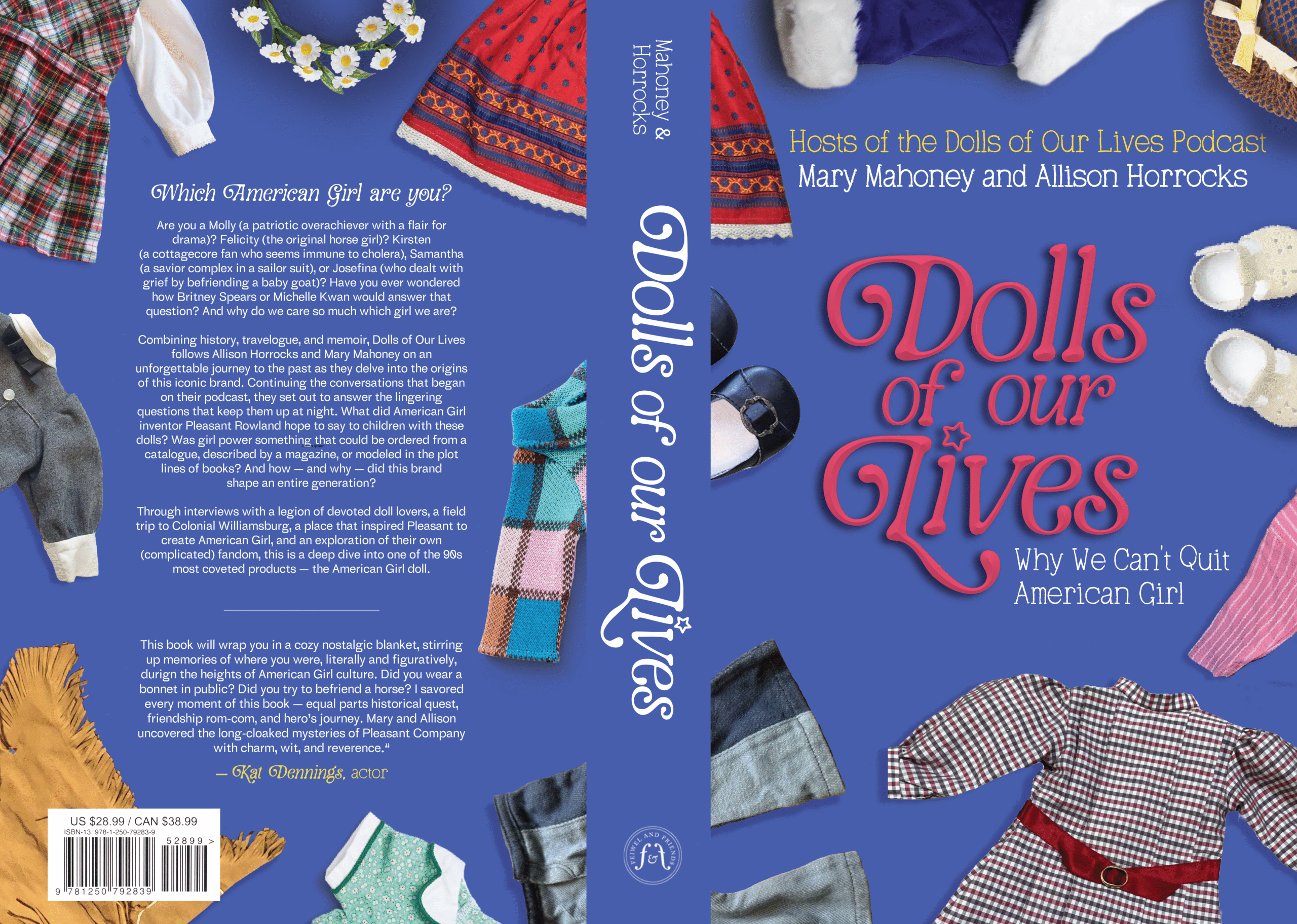
I chose the palette for this project to tie with red, white and blue, but swapped the American red for a softer hot-pink color. This color is referenced throughout American Girl projects but still exists on its own to separate it from the brand. For the typography, I wanted something fun and girly that screamed “dolls” but kept the classic, mature feelings of the American Girl brand. The star for the tittle is both a callback to the iconic American Girl star, but also feels girly and youthful.
Book Cover
One of the most iconic elements of American Girl dolls, to me, is their varied historical outfits. I wanted these clothes to be scattered across the cover as if a girl was just playing with her dolls and tossing around the clothing. Including a variety of outfits emphasizes that the book is focused on American Girl as a brand and its multiple characters, not just one specific doll.
The handwritten secondary type serves as a contrast to the more flourished main font, but also gives it a down-to-earth element that emphasizes the book’s focus on girlhood.
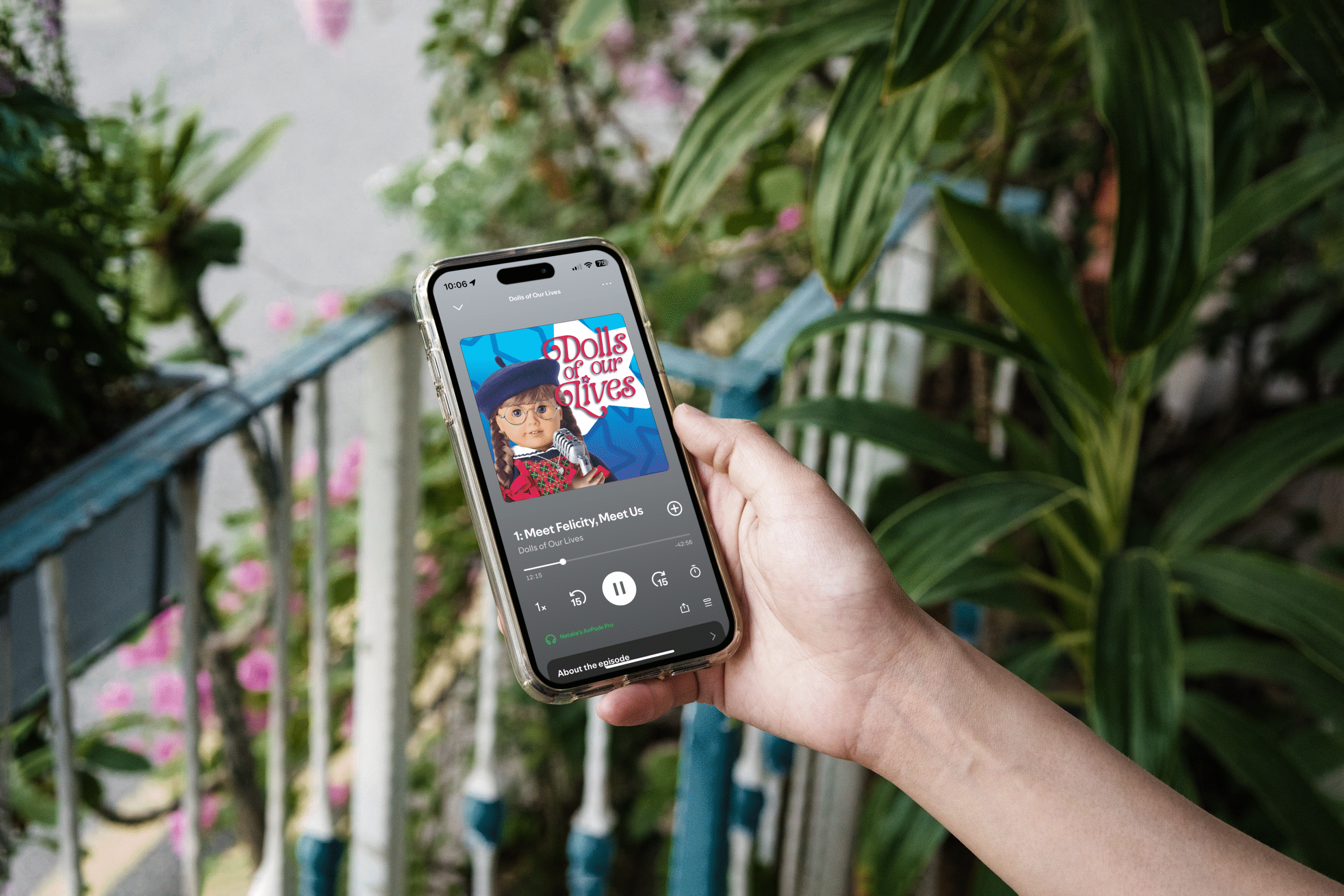
Podcast Cover
I wanted to feature the American Girl Molly front and center on the cover since the hosts describe themselves as “two Mollys” and identify so strongly with her character. The host’s voices are stronger in the podcast than in the book, so I felt that tying the podcast to one girl made sense for this while it didn’t for the book cover.
The stars in the background are, of course, emblematically American, while also being youthful and spunky.